What is
Responsive Web Design
and who the heck is Ethan Marcotte?
Regent College

"HTML is responsive by default; it's only not
responsive if you tell it not to be by giving a
pixel value somewhere"
responsive if you tell it not to be by giving a
pixel value somewhere"
-Chris Coyier
Fluid Images

Fluid Images

Fluid Images

img { max-width: 100%; }
Fluid Video w/Fitvids

video, embed, object, iframe { width: 100%; height: auto; }
$("#video-container").fitVids();
Media Queries
@media screen and (min-width: 1024px) {
   /* my styles for large displays */
}
Chaining Media Queries - Example 1
/* default mobile first styles */
.alert { display: none; }

/* tablet and small desktop styles */
@media screen and (min-width: 769px) and (max-width: 1024px) {
   .alert { display: block; }
}
Chaining Media Queries - Example 2
/* default mobile first styles */
.alert { display: none; }

@media screen and (min-width: 480px) and (orientation: landscape) {
   .alert { display: block; }
}
Chaining Media Queries - Example 3
/* default mobile first styles */
.alert { display: none; }

@media screen and (min-width: 480px) and (orientation: landscape)
and (-webkit-min-device-pixel-ratio: 2) {
   .alert { display: block; }
}
Mobile First
/* styles for mobile on up (no media query here) */

@media screen and (min-width: 768px) {
   /* tablets on up */
}

@media screen and (min-width: 1024px) {
   /* large tablets and small desktops on up */
}
Desktop First
/* styles for desktop (no media query here) */

@media only screen and (min-width: 768px) and (max-width: 1023px) {
   /* tablet */
}

@media only screen and (max-width: 767px) {
   /* mobile */
}
Getting started with
Wordpress
Twenty Twelve
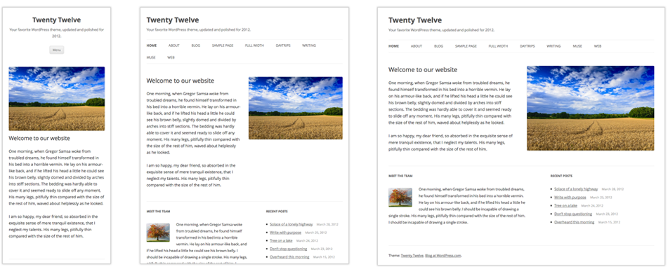
Tips & Tricks
for Building a Responsive Theme
Viewport Meta
<meta name="viewport" content="width=device-width, initial-scale=1">
Simpson College w/and w/out Viewport Meta

Asset Loading Test - FAIL
<div id="photo">Some Text</div>

#photo {
   background-image: url('picture.jpg');
   height: 100px;
   width: 100px;
}

@media all and (max-width: 480px) {
   #photo {display: none;}
}
Asset Loading Test - PASS
<div id="photo">
   <div>Some Text</div>
</div>

#photo div {
   background-image: url('picture.jpg');
   height: 100px;
   width: 100px;
}

@media all and (max-width: 480px) {
   #photo {display: none;}
}
Asset Loading Test - PASS
<div id="photo">Some Text</div>

@media all and (min-width: 481px) {
   #photo {
      background-image: url('picture.jpg');
      height: 100px;
      width: 100px;
   }
}

@media all and (max-width: 480px) {
   #photo {
      background-image: url('picture-mobile.jpg');
   }
}
Asset Loading Test - FAIL
<div id="photo">
   <img src="picture.jpg" alt="" />
</div>

@media all and (max-width: 480px) {
   #photo {display: none;}
}
Respond.js
Modernizr.load({
   test: Modernizr.mq,
   nope: 'respond.js'
});
iOS Scaling Bug

iOS Scaling Bug


Test, test, test some more
then test again later.
Xcode iOS Simulator

RWD Bookmarklet

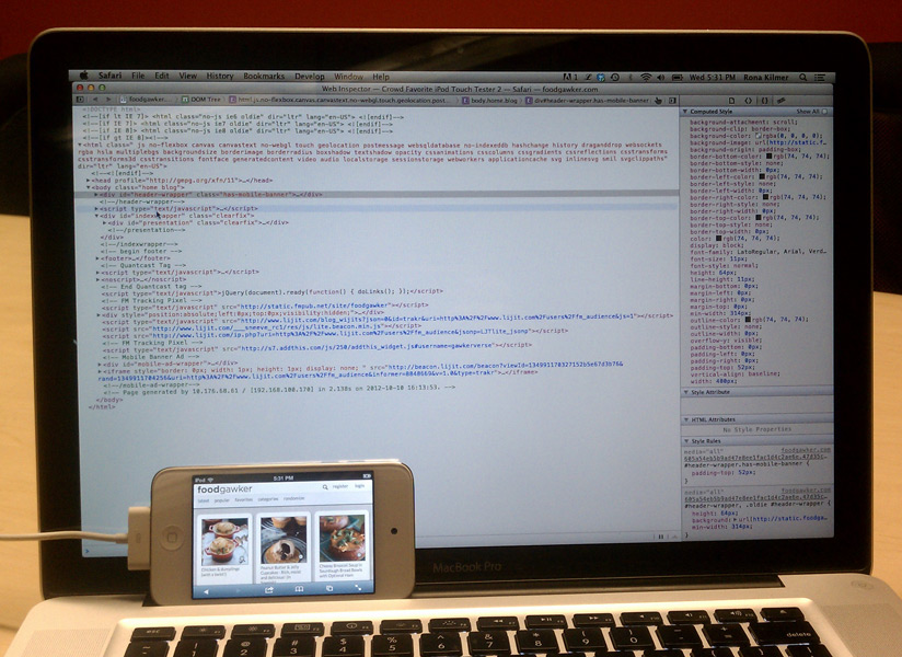
iOS 6 Web Inspector
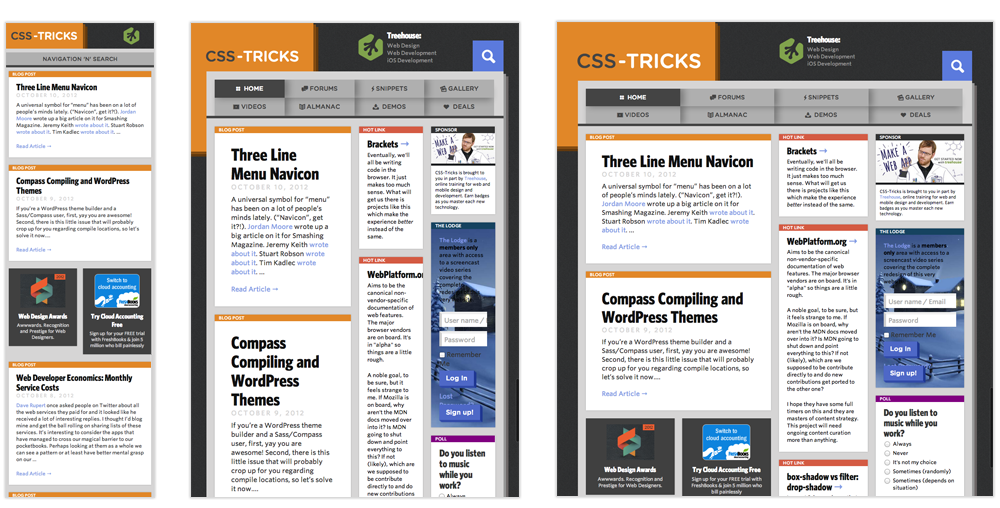
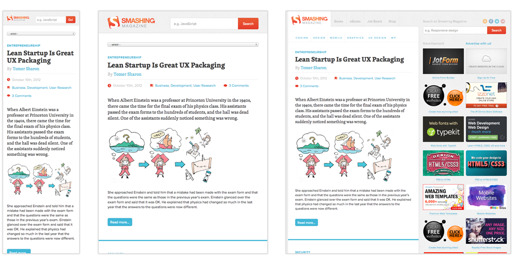
Everybody's doing it!
Foodgawker.com

CSS-Tricks.com
SmashingMagazine.com
Foodsense.is